

Process Book:
Designer for Ukraine Vs. Russia war posters
Duration:
14 Weeks
Problem:
As the war between Ukraine and Russia advances, global peace and security become increasingly more at risk. Additionally, with Ukraine at stake, there is a posed threat to the national security and foreign policy of the United States. This is because if Ukraine is poorly supported, it will encourage other countries like Russia to advance in war, which would cause global warfare. Although the battle is not being fought on our soil, the threat to our democracy and way of life is real.
My Role:
For this project, I researched and created three propaganda posters, a process book, and a poster that summarizes the entire project.
Solution:
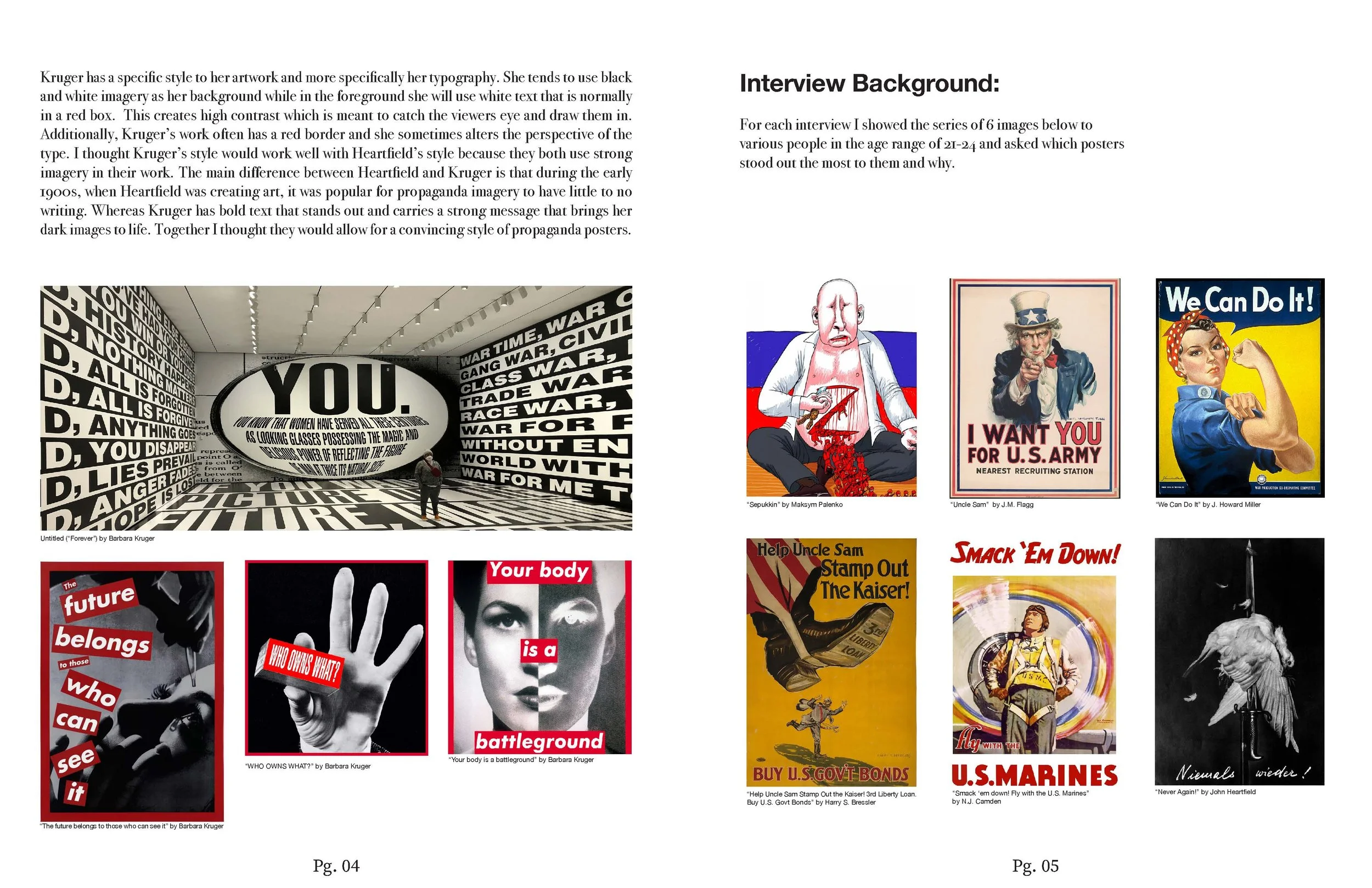
My goal was to create a series of war propaganda posters to encourage Americans to support the Ukrainian war effort. The signs drew inspiration from the visual language of past signs for peace and social justice. These posters’ visual elements are influenced by John Heartfield, a German visual artist, and the typographical factors are influenced by Barbara Kruger, a modern American artist. I chose John Heartfield as my visual inspiration because his posters consistently make me feel emotion and gain my interest. Heartfield also was a skilled photojournalist who made photo montages to convey his message. On the other hand, Kruger had strong black-and-white visuals with bold type in the foreground. This style brings the viewer in and has a dramatic feel. I could create a modern and engaging series by combining these two styles.
Research:
Two primary resources I used as research for this project were interviews and personal observation and analysis. This helped me not only understand what my peers were attracted to visually but also helped me break down what made past war posters effective. I looked at what design principles were used throughout each poster, and my peers described why they were attracted to certain signs that I showed them rather than others. I also analyzed Barbara Kruger’s artworks and what made her style so specific to her. Besides my two primary research methods, I also did secondary research, where I read scholarly articles that artistically analyzed the importance and effectiveness of certain war posters from the past.
Challenges:
When starting this project, I had a hard time narrowing down a topic. I knew that I wanted to cover a topic about war, but I did not know what to cover specifically. There are many various aspects of war that need to be discussed. For example, the treatment of veterans, the lives that are directly and indirectly affected, the earth itself and the risk that war poses, and finally, the actual types of warfare that have been going on.
Once I decided on Ukraine and the war effort, I knew I wanted to make posters, but I was unsure what the message would convey. I drew multiple sketches, looked for inspiration, and did sessions listing anything I could think of. And eventually, I thought of the three concepts I have today.
Besides those challenges, I also had to learn how to manage my time efficiently. I found that I was spending too much time on research and concept development and felt like I was rushing through the finalizing of my concepts. But, overall, everything worked out.
Learnings:
There was a lot that I learned from this project. I learned how to manage time efficiently, narrow down a topic, and finally, improve my design skills in publication and organization.
This project helped me use grids and improve my understanding of how to use them. With the propaganda posters, I worked with warped text and dynamic grids. At the same time, with the magazine, I learned how to use grids to create a more interesting layout and a more effective hierarchy of information. And finally, with the large poster, I learned how to organize large bodies of text with large and bold imagery.
Programs:
Adobe InDesign and Photoshop


